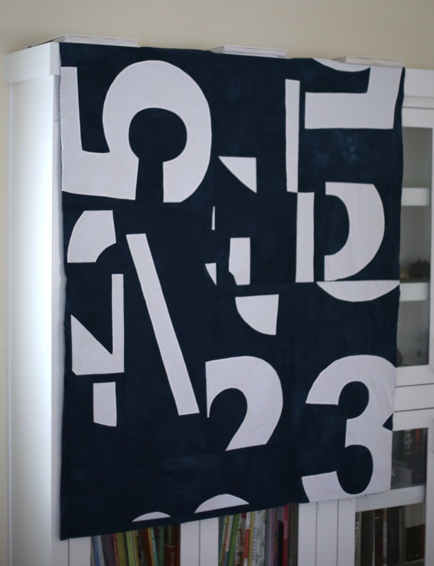
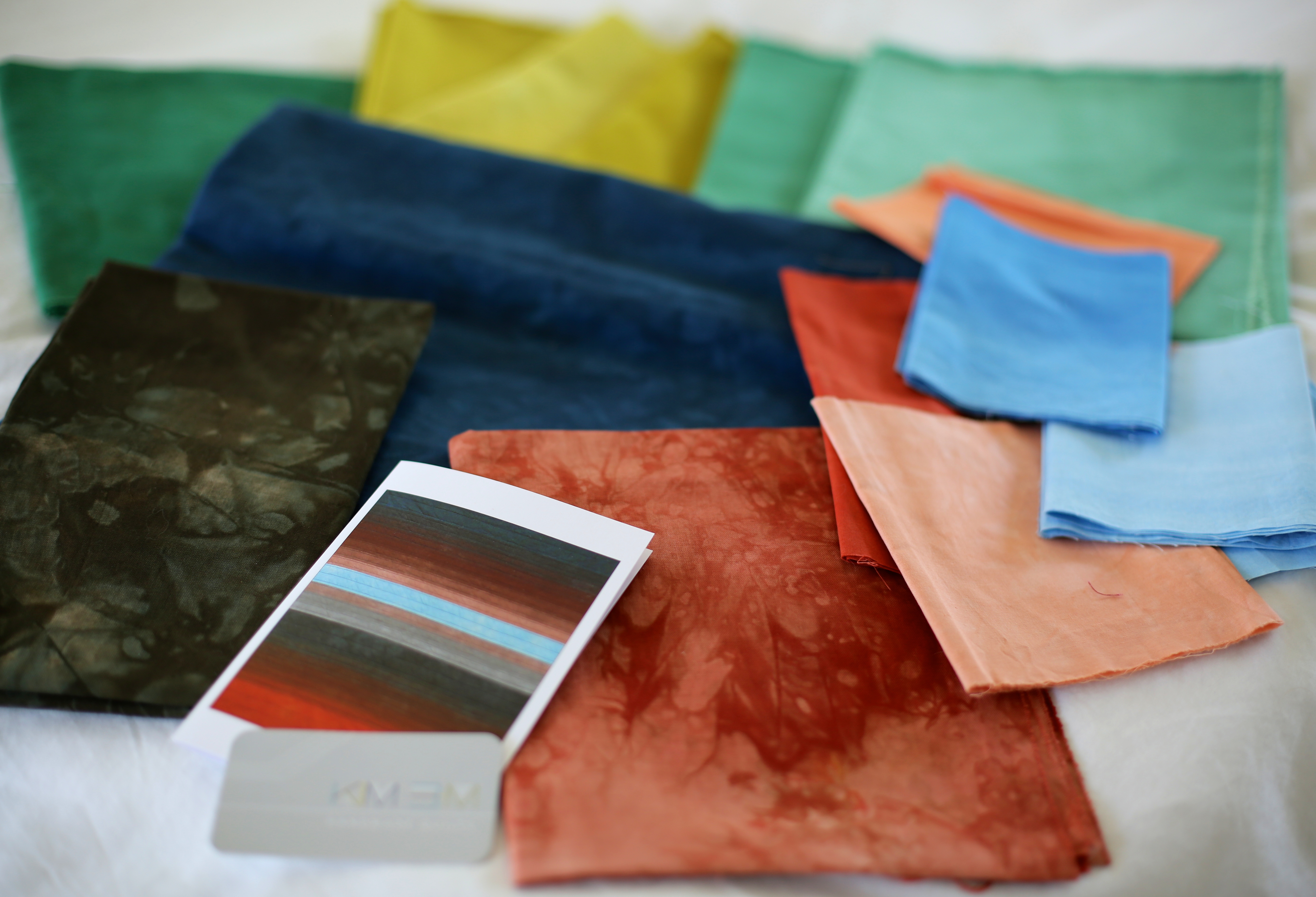
Working in an Emergency Department sometimes feels like being at ground zero of a community’s addiction issues and my medical career thus far can be classified by the locations and eras I have practiced and favored drugs of abuse: Seattle – Heroin, Cleveland – Crack Cocaine, Sacramento – Methamphetamine and now in Northern California – Prescription Narcotics. Wanting to portray the mixed blessing of prescription narcotics and inspired by the modern painter Cecil Touchon, I dreamed up a statement quilt. 5/325 stands for the most common dose of hydrocone/acetaminophen my colleagues and I prescribe. I have long admired the hand dyed fabrics of Kim Eichler-Messmer and am a huge fan of her book. This quilt and a few others I have planned call for these kinds of special fabrics. With limited time to make my own, I went straight to the source with my kooky ideas. Although Kim didn’t know I was planning to make a quilt specific to prescription narcotics, amazingly she was willing to play along and hand dyed fabric for me on commission. (If you ever get a chance to see or purchase her quilts, fabric or book do it!)
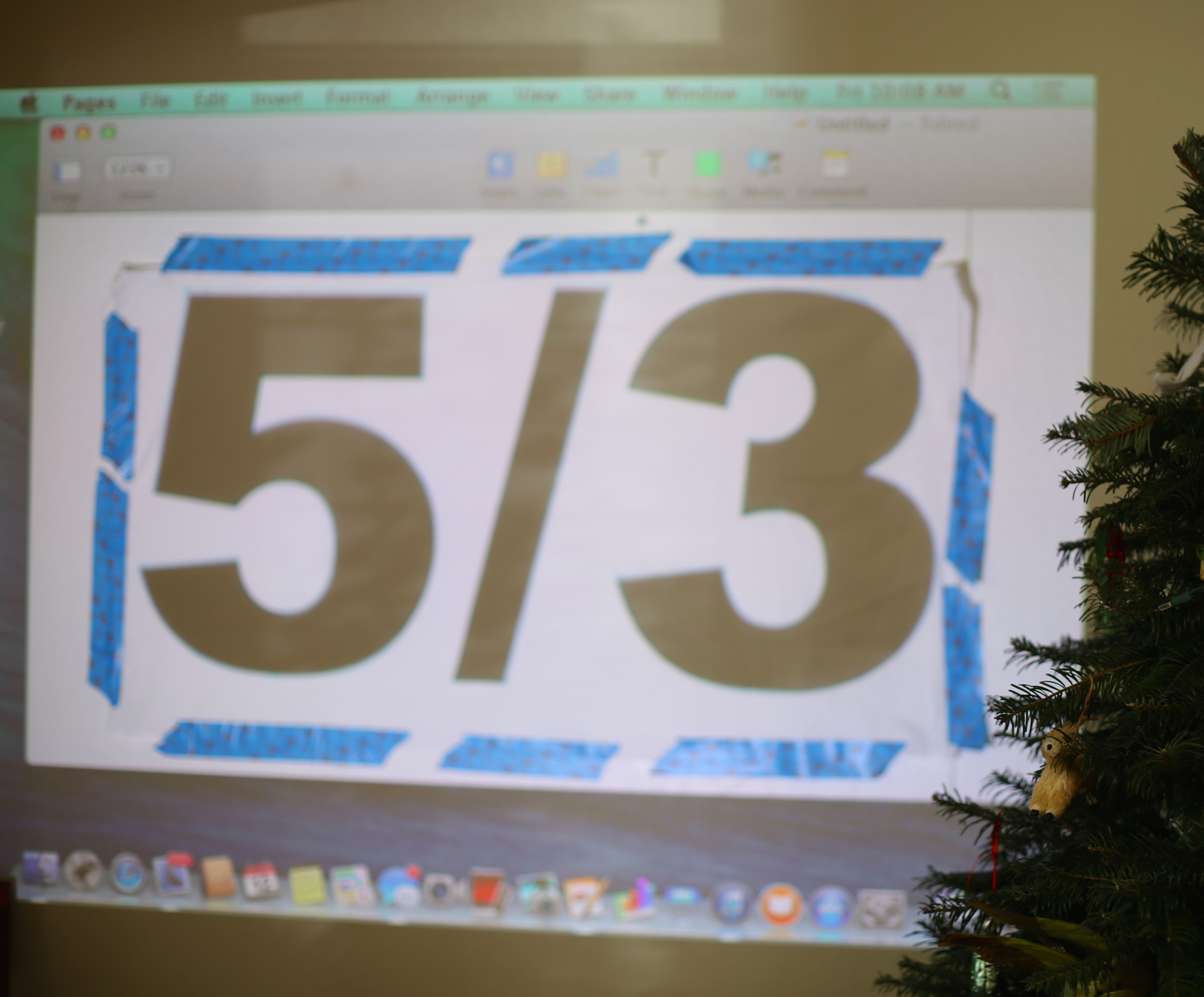
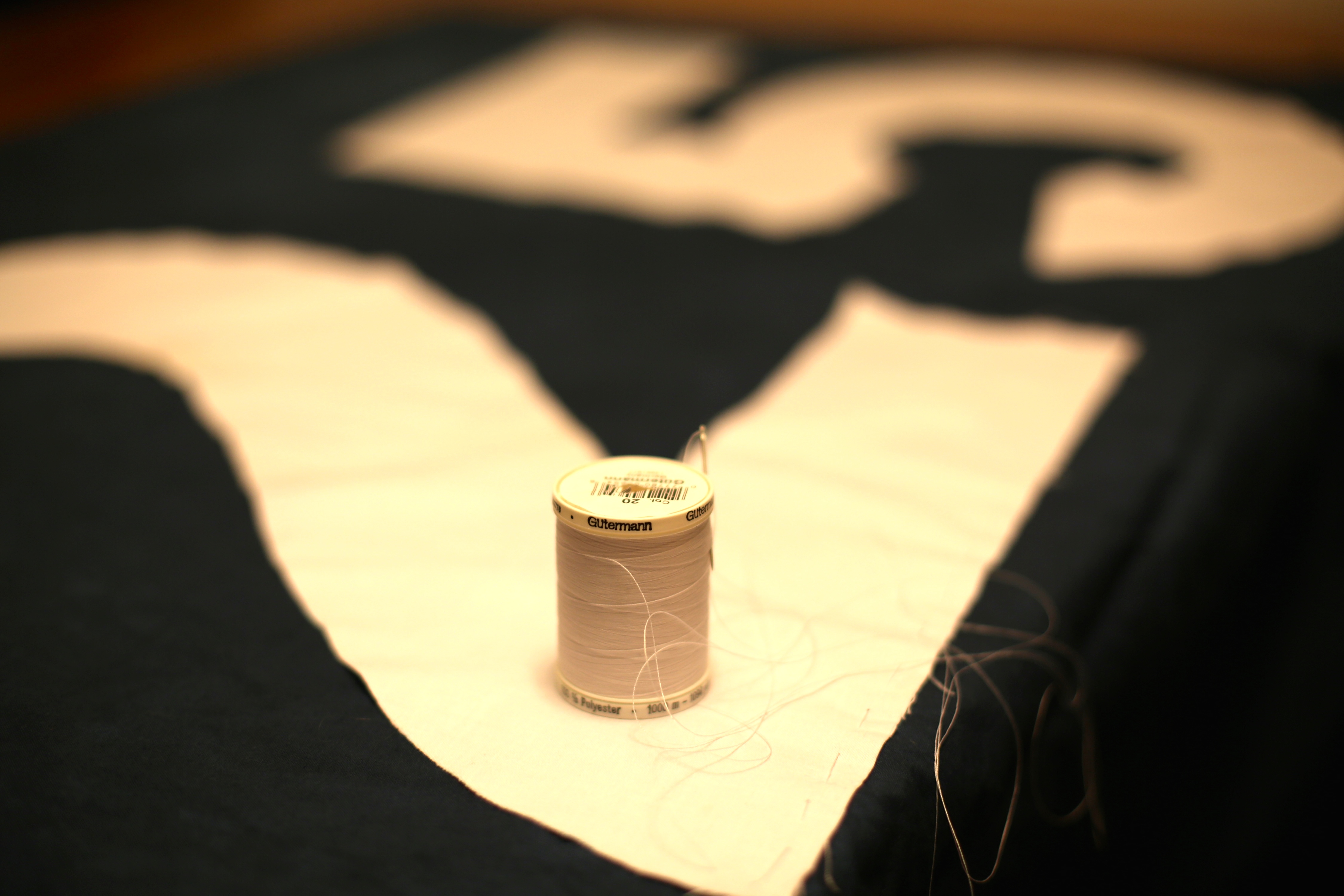
To start this piece, I grabbed my laptop and projector, found a bold font I liked and traced 5/325 onto the white fabric.
I then hand basted the it to Kim’s beautiful blue fabric. Channeling Touchon, I cut up the fabric randomly and then needle turn appliquéd each wonky piece.
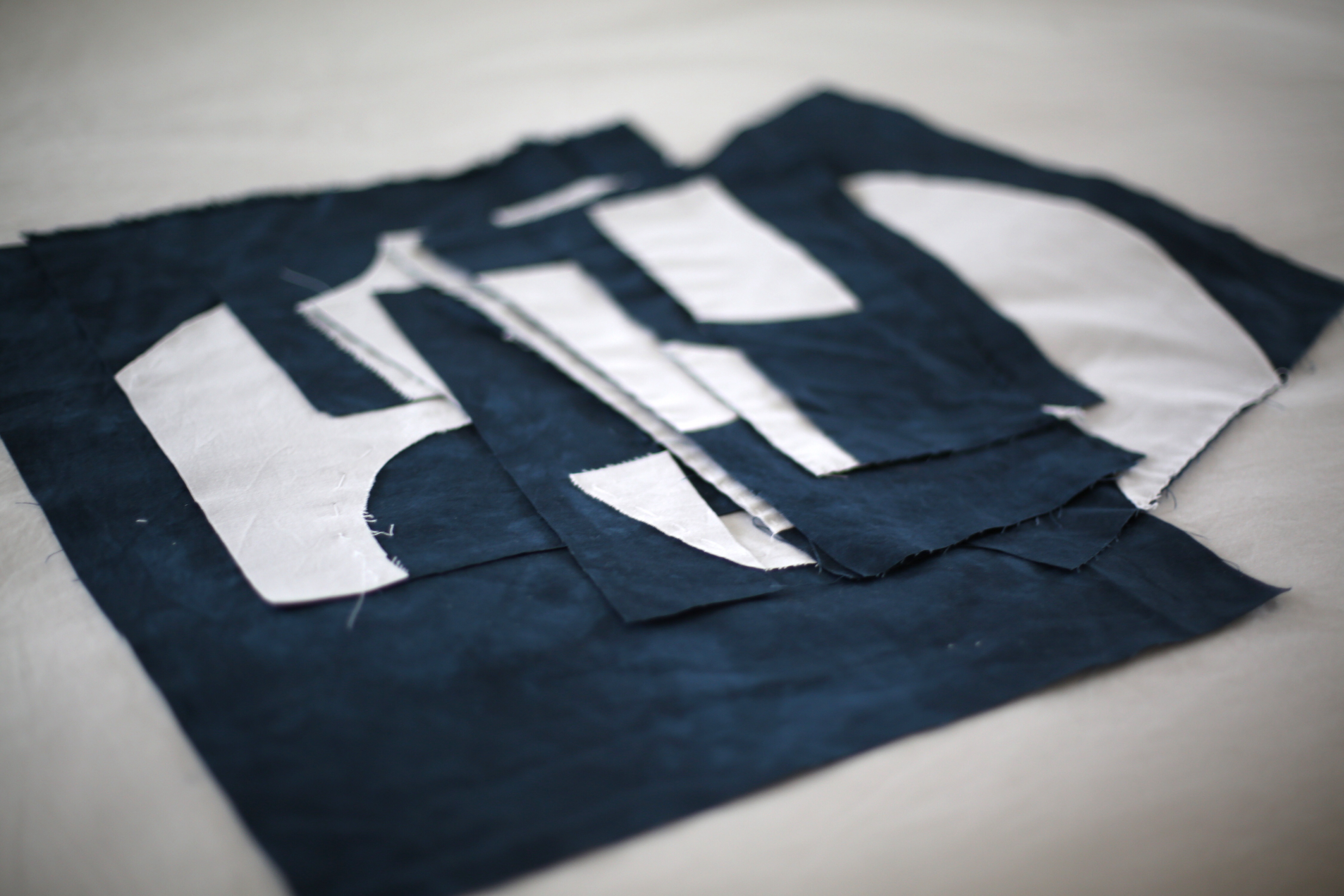
Finally, I put together the pieces like a mixed up puzzle and machine sewed them together again. I got to try out Y seams for the first time with some luck. Finger pressing the seams as I wanted them to lay then sewing on the folds I had formed seemed to work.

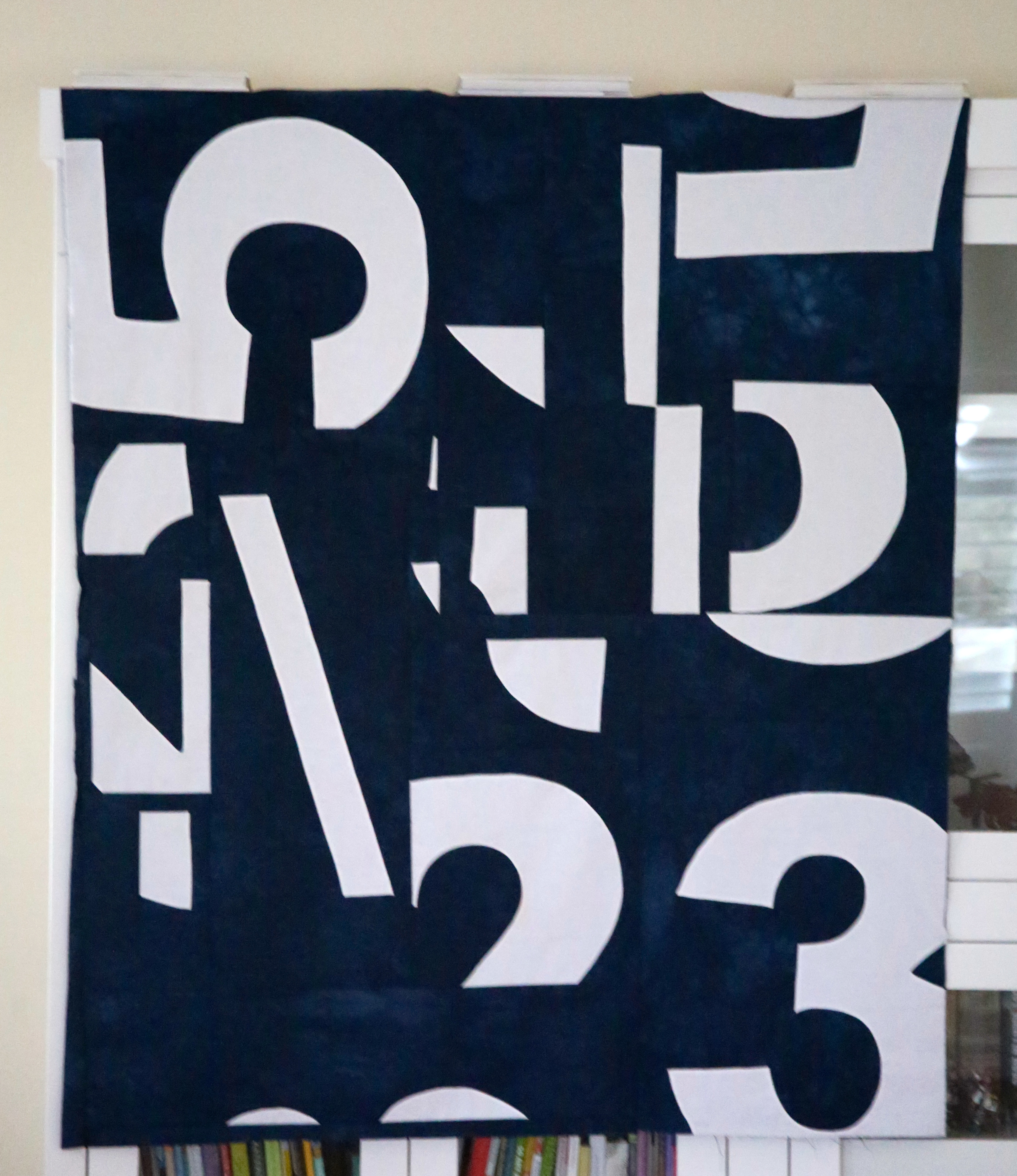
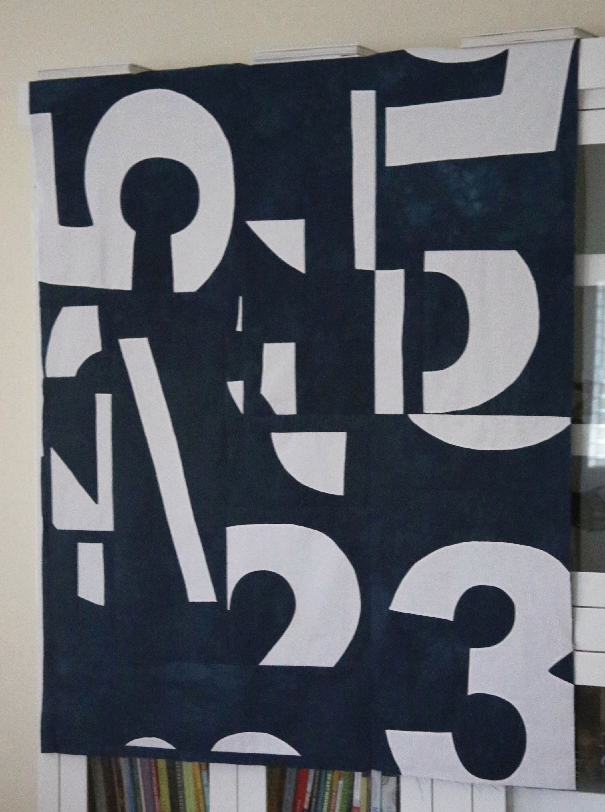
I’m hoping to hand quilt this piece and would like to explore finishing the edges without binding.
Wish me luck.
Hillary

Thank you for sharing your thought and technical process. I was curious to know how the numbers were sewn. Your needle turn appliqué looks perfect.
Thanks Agnes. This has been such a fun project. Look forward to moving forward with it! 🙂
How you got the idea and the background behind that, the bold cutting and mixed in appliqué and how it all worked out, the nerve of it, it looks really great!
(I have been experimenting binding without showing the binding, like folding it completely back.. but no great solution to share yet…) I loved the broken heart quilt from umbrella prints so much and now it seems you have taken some such idea another step further along. I love this one! Good luck !
Oh that Broken Hearts Quilt from Umbrella Prints is such a fave of mine too. I never really thought of the association/comparison to this quilt top but I do see it now. Interesting how all around influences us. I look forward to seeing you more on IG. Happy New Year.
I always enjoy reading the process of your creativity: it is so inspiring. You work in a really hard reality and it is so inspiring to see how you use this reality to trun it into beauty! this quilt is wonderfull and I love that navy background. I am looking forward to see what you make for the binding. You are amazing, and I wish you a great christmas. Much love from France
Hi Sophie! Hope you are having a nice break full of family and fabric. Happy New Year. 🙂
Hillary, Victoria Gertenbach at The Silly Boodilly has a tutorial on making quilt facings. I’ve also used one from a Google search and the keyword might have been flat facing. It worked well. I love this quilt so far!
Thanks Audrey. I will definitely check Victoria’s tutorial out. I have always loved her work!
First of all, love the quilt! Very graphic and cool. About binding, or lack thereof, my grandmother did a lot of “knife-edged” binding, where she took 1/4 inch all the way around the piece and turned it inside and sewed the outside with an almost invisible stitch. I have done it a few times too and it works very well . For example i have a quilt of hers she made for my dad 80 years ago when he was born and the stitching is still tight and invisible and the edges of the quilt are even jagged!
Ooh your mom’s quilt sounds cool. Enjoying the whole process of this quilt. Thanks for the suggestions.
As someone who only takes Panadol once every few months for a rare lack-of-sleep headache, I struggle to imagine the troubles you face in your job.
I am always impressed by the thought and meaning behind your work – both the materials you choose and ideas you express.
Thanks Carla-so very modern of me huh? I need to work on pretty and light in the New Year. Happy holidays!
Hillary
Very modern! So your New Year challenge will be something pink, floral and girly?
I love that you shared your vision and process. Your quilt perfectly speaks to the mixed up craziness of addiction.
Thanks Ruthann! Interesting how making something with purpose is so satisfying?!
I love your approach to the design and the issue.
Thanks Leanne. I’m learning so much from this project-really, really fun. Happy New Year!
Hi Hillary,
These replies don’t come to me via email and just to let you know I do not revisit blog posts so will not ever see your lovely replies. Many of us reply to comments via email where a non public conversation can occur and sometimes continue.
i love getting to see the process; the result is stunning! and the meaning makes it all the more wonderful.
Thanks Chawne your hand stitching is once again inspiring me. Look forward to finishing this guy up.
Amazing quilt. Interesting to hear about your work too.
Thanks Ann!
Fascinating art/statement piece! I second Audry’s binding suggestion. I’ve done this method several times for art pieces.
Definitely going to check it out. I’m learning so much!
You rock! As a former addictions counselor this resonates strongly with me. I love your thought process and your execution is spot on. The confusion, chaos, and clarity are evident. I love your use of black and white here and the scale of the numbers has such a graphic punch! Well done!
I cannot offer any advice on the quilting elements, but I think this is great.
OK wait, you have been an addiction counselor too? How many lives have you lived? I’m sending you another package in the New Year Bianca because I want you to be part of my ” Nude is not a dress color quilt”. I’ve asked friends from around the world to send me paper pieced dresses using their skin color and collectively we are going to make a big statement!! The more voices, the stronger the message and well you have to be part of it. I’ll send you the pattern, you just have to pick fabric that matches your skin color and that of the rest of your family (kids, husband). Are you game? Happy New Year
I am full of surprises! I still don’t know what I want to be when I grow up! I would love to be a part of your quilt! How awesome would that be! I love the work I have seen so far and would be honored to participate. Your support on this issues has meant so much to me. You will have to tell me more about my contirbution; my family is coffee (me) cream (hubby) and cafe au lait (kids). I could dye a batik…? 🙂
fascinating peek into your mind and process
Yes this twisted mind of mine is tres interesting no? 🙂
Wow and wow and wow.
Thanks!
Such a great quilt! I enjoyed hearing about your inspiration. Your design using typography is something I hope to work with someday, but I hadn’t seen many examples of it done really well until now!
It reminds me of the Stendig Calender at MoMA. Designed in 1966 by Massimo Vignelli.
I LOVE all thinks MOMA and typography. Must check out that calendar. Thanks Lauren
What a great quilt! I liked hearing about your inspiration. I’m a typography fan and I’ve often thought about a modern quilt incorporating fonts but hadn’t seen any examples of it done well, until now! You must be very proud.
It reminds me of the Stendig Calendar at MoMA in NY, designed in 1966 by Massimo Vignelli.
Love the quilt story and construction. As always, I can’t wait to see the finish!
Thanks Stephanie. Was hoping to work on it a bit over vacation but we have mostly been a tangle of kids and friends and photography-all good. A time and place for everything. Happy New Year!
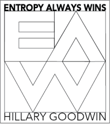
Entropy is certainly winning here! You are always full of such inspiration! Fantastic and beautiful!
Hillary, after looking at your beautiful flower on Instagram today I thought I would check out your blog. It’s nice to put a face to the projects I have been admiring. I am a home mom right now but use to be a triage nurse in an IM office. Controlled substance scripts were truly the worst part of that job. I know they are vital for many patient’s quality of life but the level of abuse and miss use is deeply disturbing. Anyway thank you for sharing your art and process. Amy